

The Team:
Irene I.
Ariella M.
Jill M.
Raquel W.
Aaron C., Web Developer, ConsultantMy Role:
UX Researcher
UX Designer
UI Designer
Scrum Master — I was selected to be the scrum master for my team, and in this role encouraged utilization of group facilitation and collaboration tools. I liaised with the principal project leads, ensuring that there was open communication within the team and with the project managers.The Challenge:
For this project, our primary decision was to choose a subject that we all felt enthusiastic about, and then engage in the process of building a digital product. Through topic mapping we discovered a strong collective interest in nutrition. We were fascinated by how certain foods could be used to treat particular ailments. We were also curious about how dietary intake had influence on one’s energy level, productivity, and emotional well-being.
The following documentation contains a description of the process and related deliverables involved in the creation of Remedi.

Hypothesis:
We believe that creating a platform that contains information about immediate relief, as it pertains to nutrition, will be beneficial for busy users to enhance their overall well-being and mood. This will increase their productivity and help them to maintain a healthy mindset.
In this research phase, we sought to understand the behaviors of users within this category and identified potential opportunities. We would then decide on the optimal platform for the application.
Deliverables:
User Interviews and Report
1. User Interview Documentation:
Interview script/Discussion Guide was written.
Conducted interviews using open-ended questions that led to insights in the problem space. Recording and notes were taken.

In this phase, we synthesized the acquired research data.
Deliverables:
Insights
Affinity Map
Persona
Journey Map
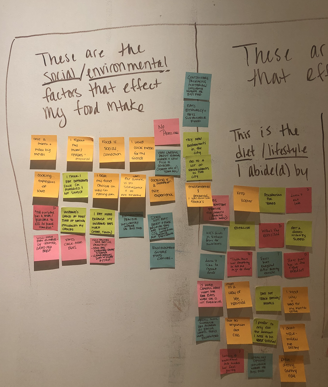
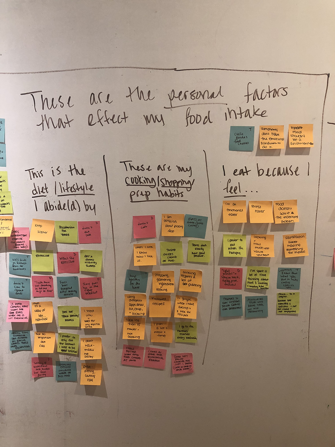
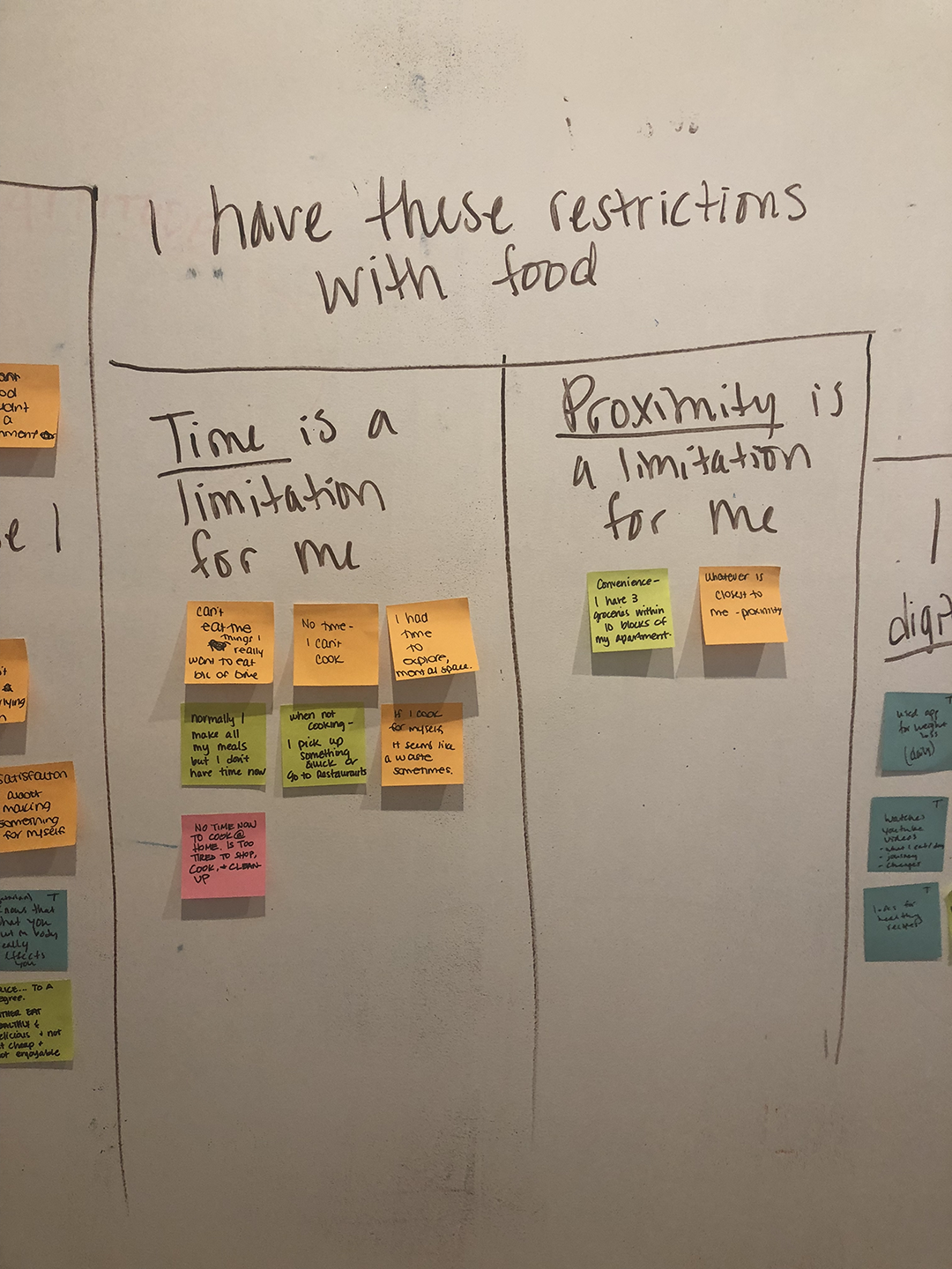
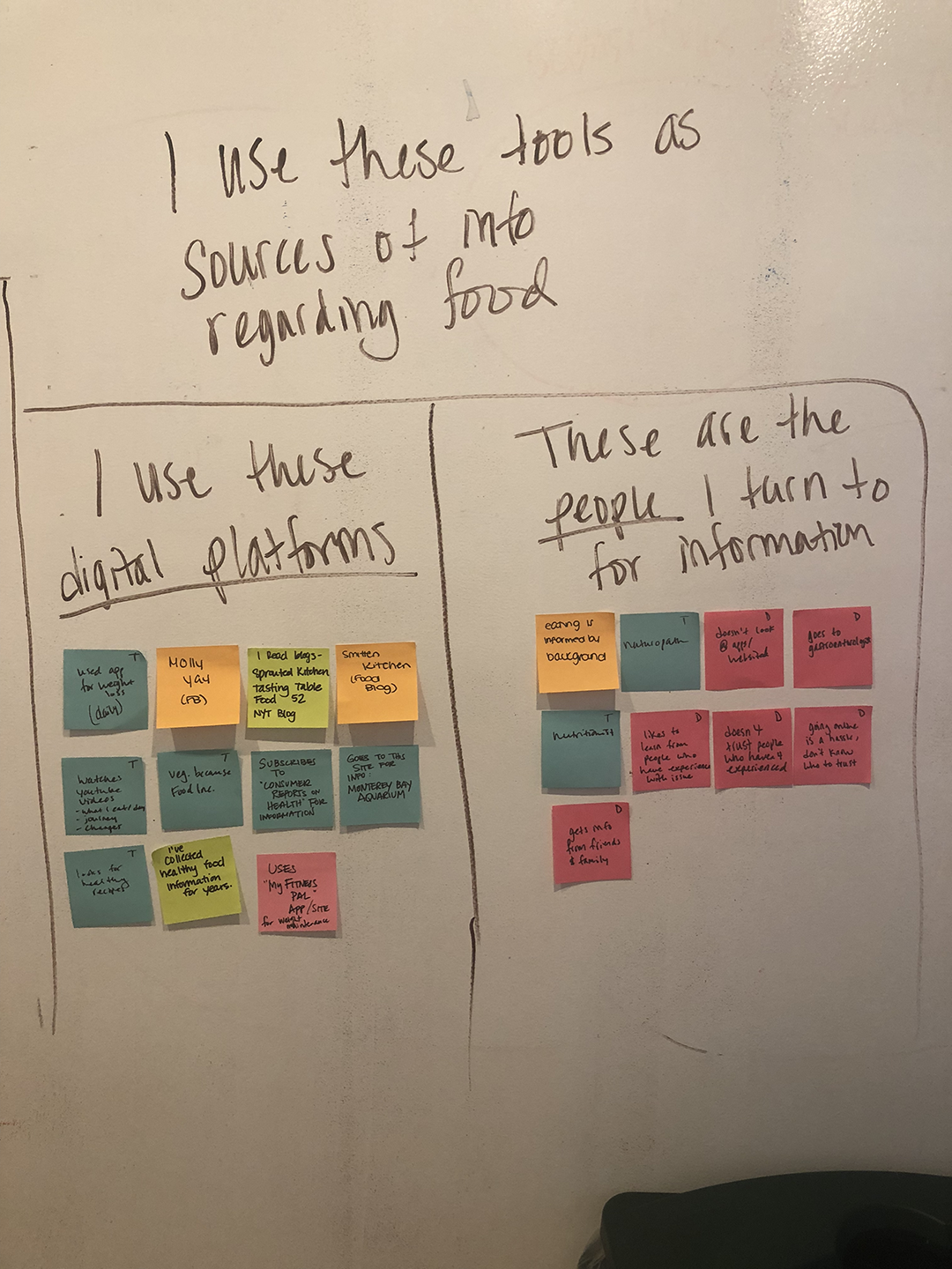
1-2. Insights | Affinity Map:
We collected insights from the interviews using affinity mapping. Themes that emerged from our interviews were gathered.
We focused on identifying who the user was, what they did, and their motivation.
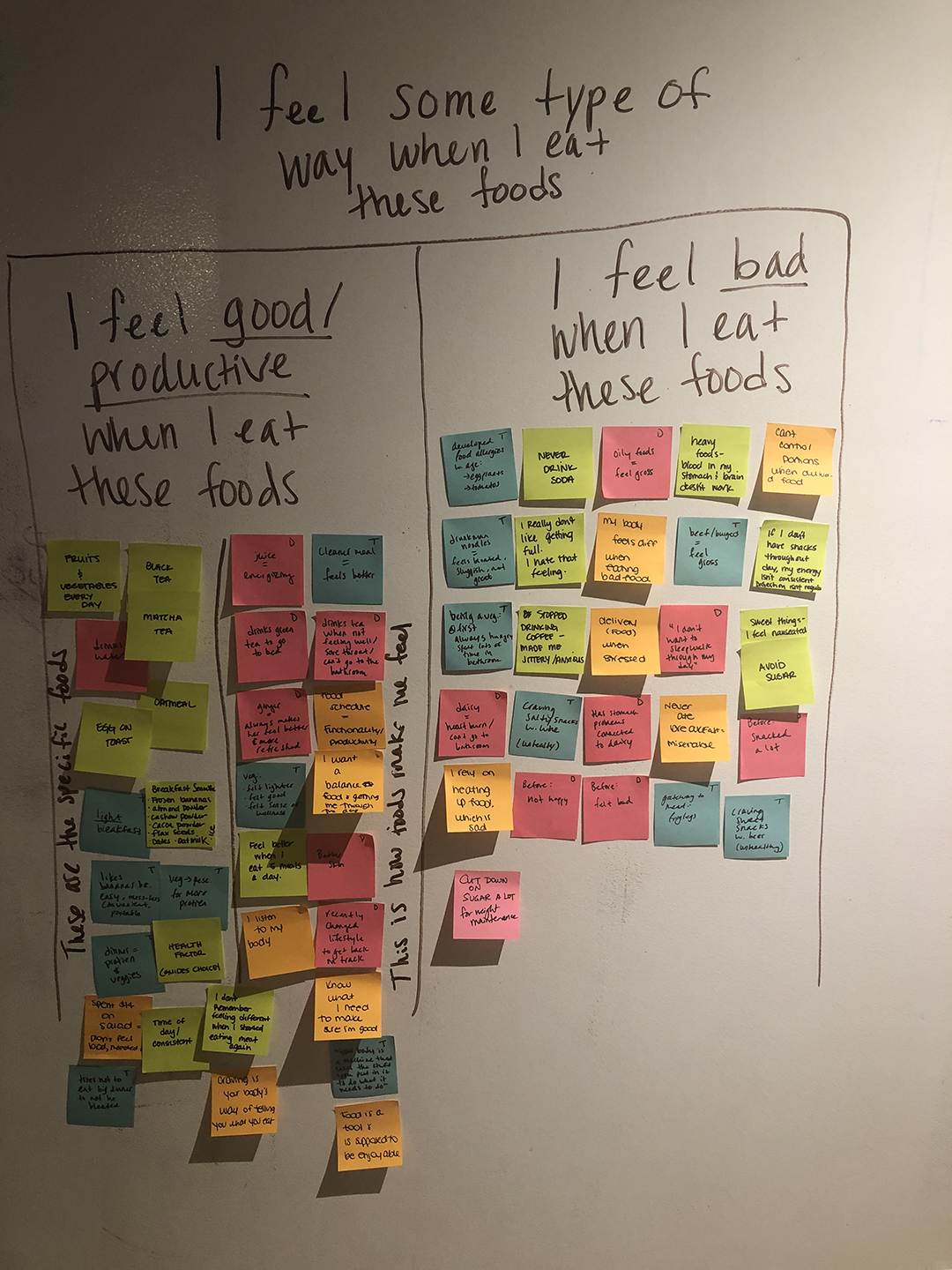
6/6 users feel better/more energized/more productive when eating healthy foods
6/6 users know what kinds of foods make them feel more productive
6/6 users wanted more information on what foods will make them feel even better
6/6 users have some sort of diet/lifestyle that they abide by
6/6 users hold eating healthy as a priority to feel better
4/6 users have time issues on preparing food
5/6 users use digital platforms for information
3/6 users turn to friends and family for information
User Quote:
“If I don't eat breakfast, I'm not a functional person...I know when I am missing a meal...my body needs food...My body feels better when I don't have unhealthy food. I have a breakdown when I'm not eating...I feel like an athlete, I have to treat myself to healthy food in order for my brain to work properly.” ~ User 3
3. Persona:
We identified and created a primary persona utilizing insights from our interviews.

4. Journey Map:
We included relevant touchpoints that highlighted the user’s existing behavior within the problem space of energy and healing with respect to nutrition.
We applied our research to inform our documentation of the user’s behavior.

“How Might We…?”:
We constructed a problem statement that was focused and supported by the user research conducted.
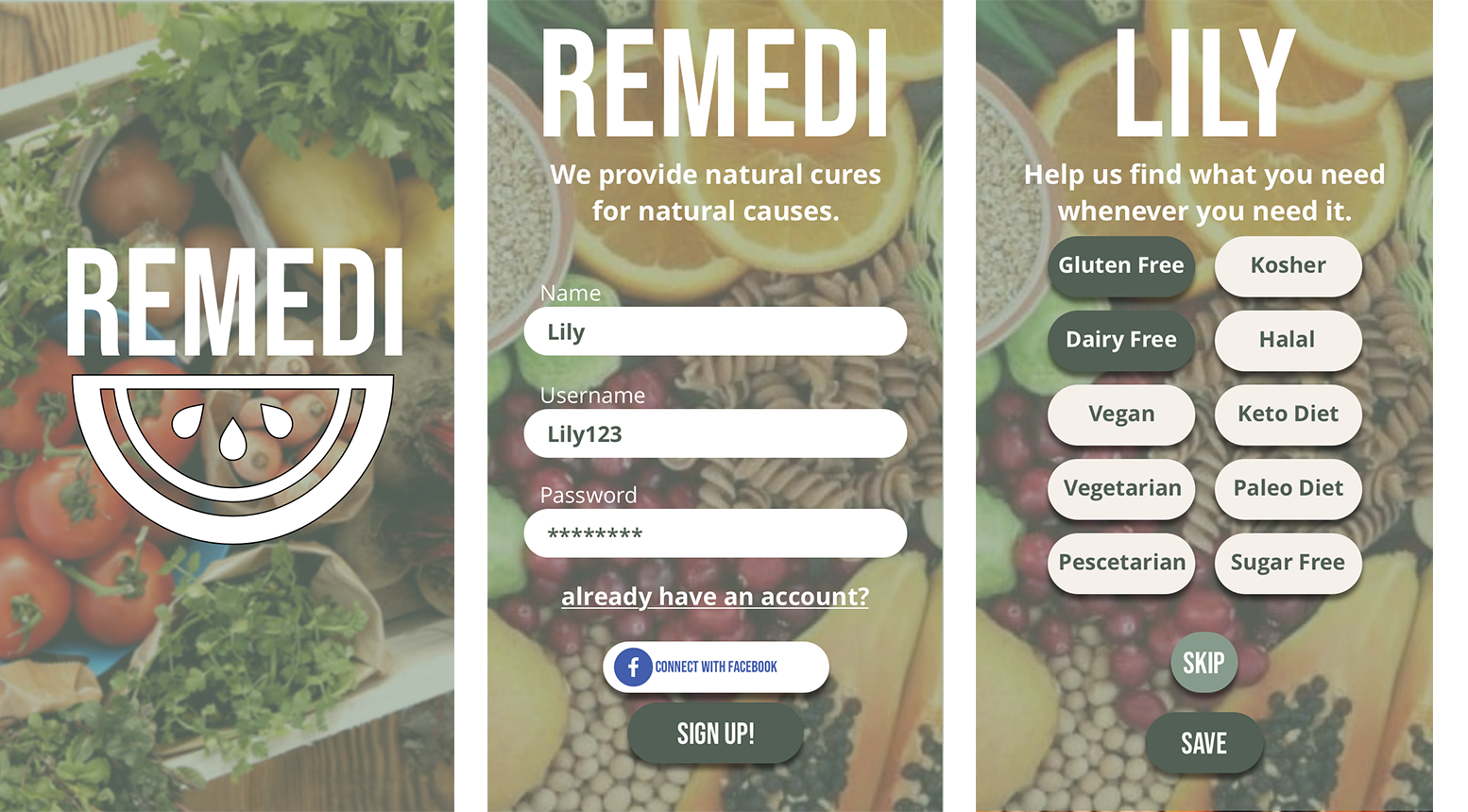
“Busy users want to enhance their overall well-being and productivity by consuming food with the proper nutrients. They need to have healthy food options that are available on the spot and within close proximity.
Lily keeps a busy schedule but still wants to include healthy solutions to help her feel her best. She needs a platform that would inform her of nutritious and wholesome food choices quickly.
How might we help Lily optimize her search for quick fixes for commonly-experienced ailments?”
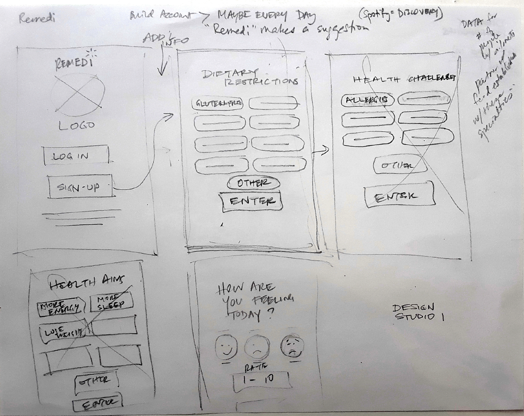
In the third phase of our process, we decided on the platform and conducted a Design Studio in which all team members ideated via timed sketching sessions. We then we applied the MoSCoW Method Map to assist us with feature prioritization.
Deliverables:
Platform Choice
Design Studio Documentation
MoSCoW Map
Competitive Analysis
1. Platform Choice:
Based on our research and its synthesis, we chose the best suited platform for our digital product.

2. Design Studio Documentation:
We conducted three rounds of Design Studio to define initial ideas, prioritize features, and assess what the Minimum Viable Product (MVP) should be.. It was the first Design Studio that our Web Developer participated in, and he found it to be an extremely beneficial tool.
Each team member made quick hand-drawn sketches on paper visually describing a sequential task. He/she then had the opportunity to talk about them. All team members subsequently took turns relaying their feedback on the idea. Each of these processes was limited in time.
3. MoSCoW Method Map:
Features that Must, Should, Could, Won’t be included
Using the MoSCow Method, we established the feature prioritization for our mobile app.

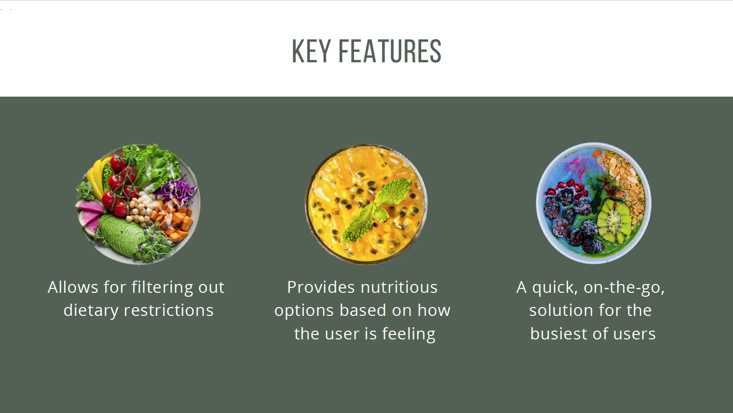
Some key features we focused on:
4. Competitive Analysis:
We examined the competitive landscape and researched other mobile apps and websites that offered support in the nutrition/diet sector.
We compared our feature ideas to solutions in existence in order to see how our digital product would stack up to the competition and where we might improve or augment. This information was important to our stakeholders and validating for us.
We produced a competitive matrix and a chart listing features from Remedi and other companies.


In this phase, we implemented what we ideated in Phase 3. In this stage of the process, prototyping, testing, analyzing, iteration, and re-testing occurred.
Deliverables:
Low-Fidelity Wireframes
Mid-Fidelity Wireframes in Sketch
Clickable Mobile Prototype in InVision
Usability Testing report
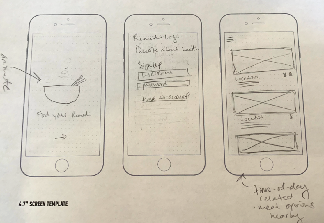
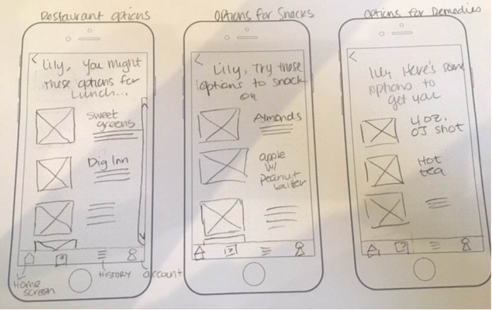
1. Low-Fidelity Wireframes:
Based on our ideas garnered through the design studio, we drafted the basic structure for our mobile app.


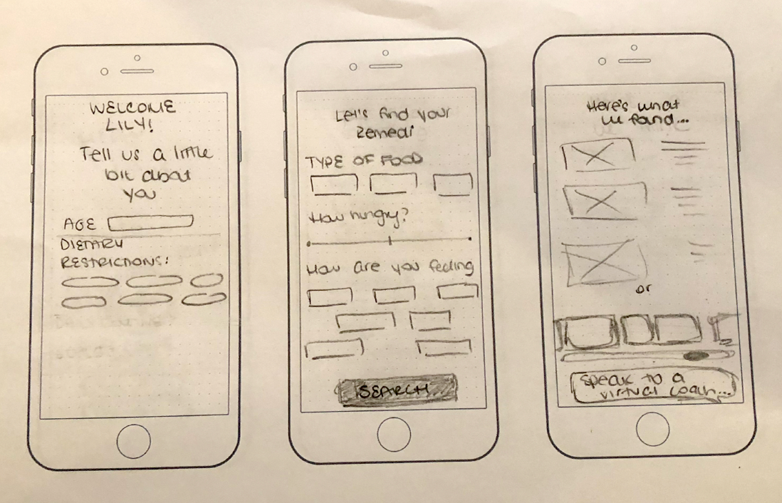
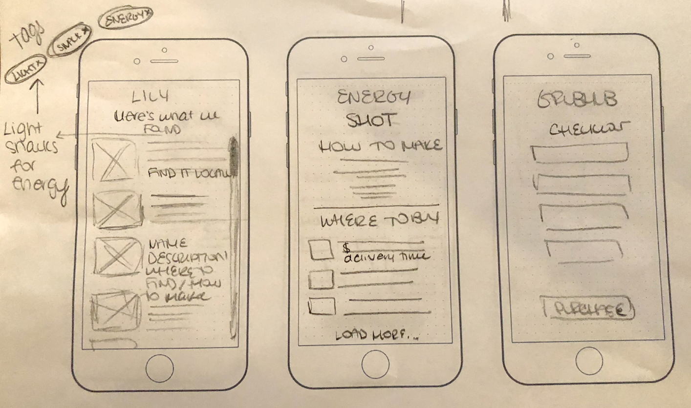
2. Mid-Fidelity Wireframes:
After determining our feature prioritization and devising the foundational structure of our mobile app in our low-fi wireframes, we produced the mid-fi wireframes using Sketch.
The mid-fi wireframes contained the rudimentary navigational components, and symbols representing the basic content of the app.
They were functional and assessable, but stripped of developed visual design.
3. Clickable Mid-Fi Mobile Prototype in InVision:
Applying our mid-fi Sketch wireframes, we created a clickable mobile prototype that was functional and that contained a navigable pathway, which could be assessed with a usability test.
The mid-fi wireframes’ primary function was that of utility and therefore devoid of visual decorative elements or branding.
4. Usability Testing & Documentation:
We tested our mid-fi prototype on 6 users by first providing them with specific scenarios and tasks that they would fulfill through the navigation sequence in our app. We recorded their actions and comments as they completed the tasks.
After the usability test, we asked them questions about their experience using the prototype and also to rate it.
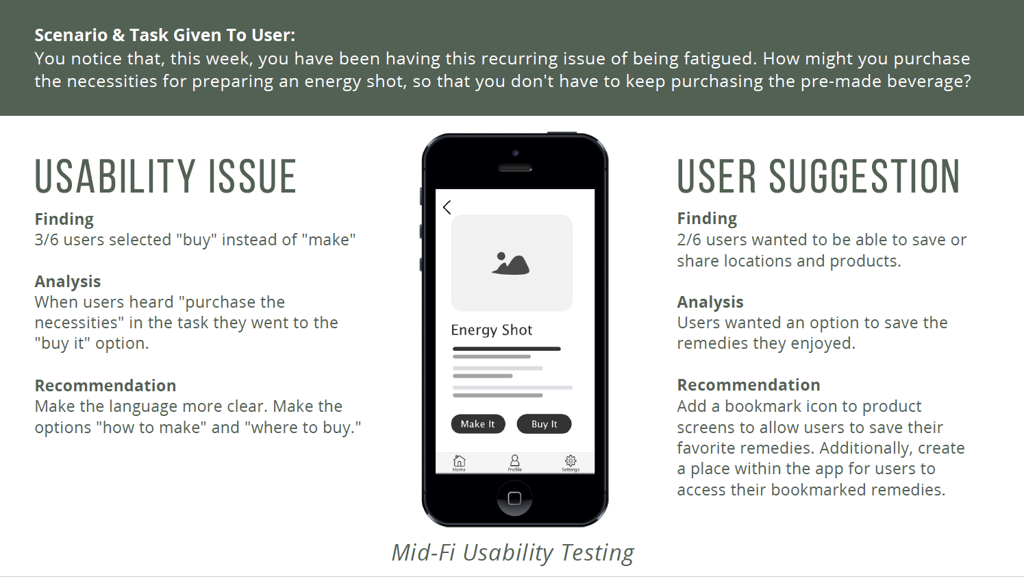
In this stage of our creative process, we reviewed and considered the data gathered in the mid-fi usability test and applied necessary changes and recommendations to produce an improved iteration. This higher-fidelity version incorporated visual design elements such as color, varied typography, photography, and more distinct “Call to Action” affordances. We tested our prototype and executed changes to comply with accessibility standards.
Deliverables:
High-Fidelity Sketch Wireframes
High-Fidelity Wireframes with Annotations
Clickable InVision Hi-Fi Prototype
Usability Testing & Report for High-Fidelity Prototype
Accessibility Report
iOS HIG Compliance
Partnership
Specifications Document
1. High-Fidelity Sketch Wireframes:
This final iteration reflected a higher level of fidelity with attention to effective and aesthetically appealing visual design.
Wireframes included an appropriate amount of detail, consideration of hierarchy, and were consistent in quality.
Wireframes conveyed the overall design concept and an evident direction from entry point to fulfillment of an intrinsic task.
2. Hi-Fi Wireframes with Annotations:
Detailed annotations of the Hi-Fi wireframes in clear, descriptive language were produced and provided to our web developer for the purpose of building out the app.
Annotations were standardized in formatting, with labels comprehensible to any audience.

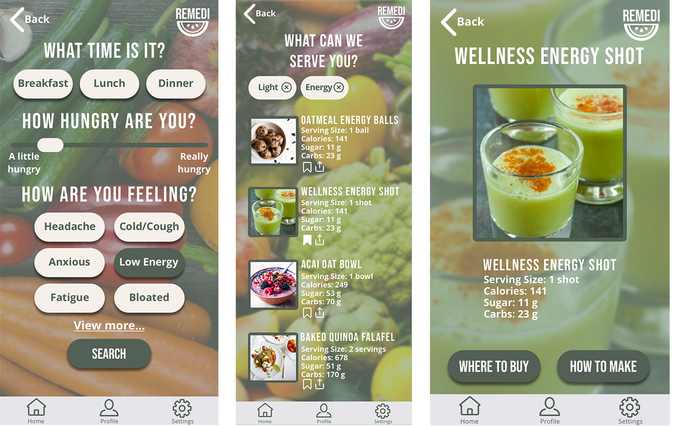
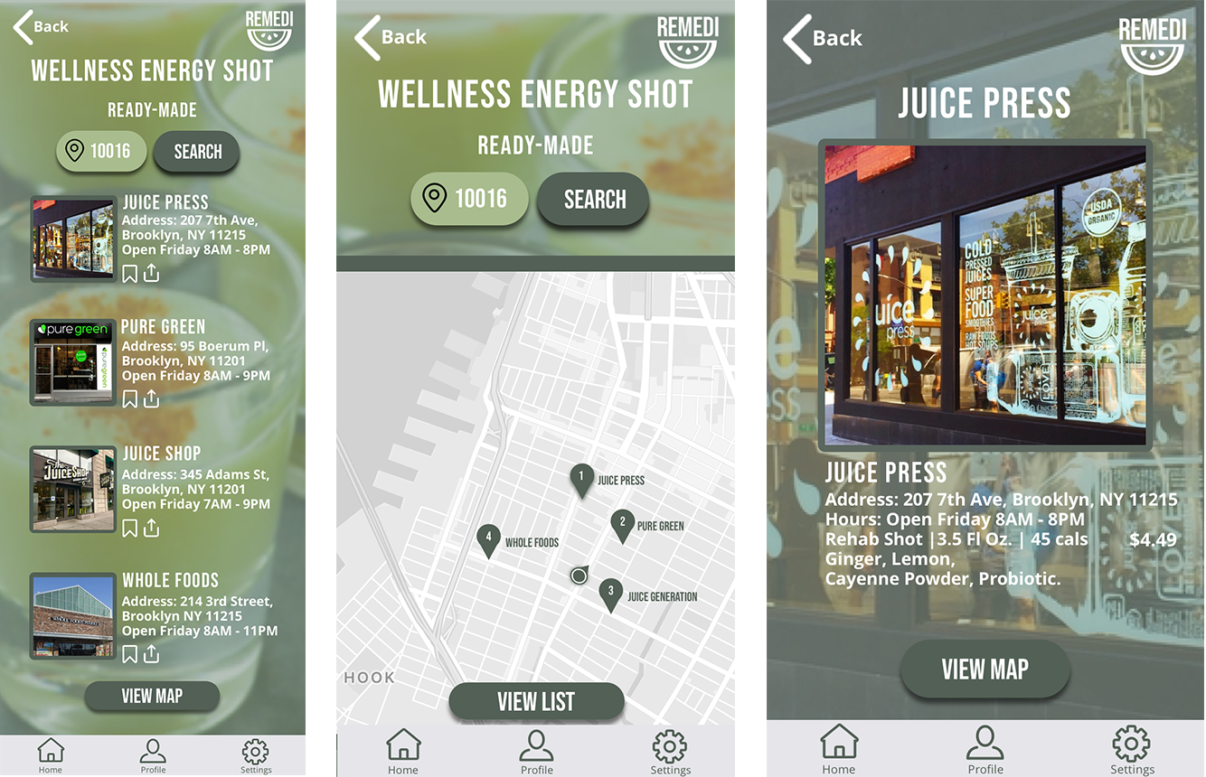
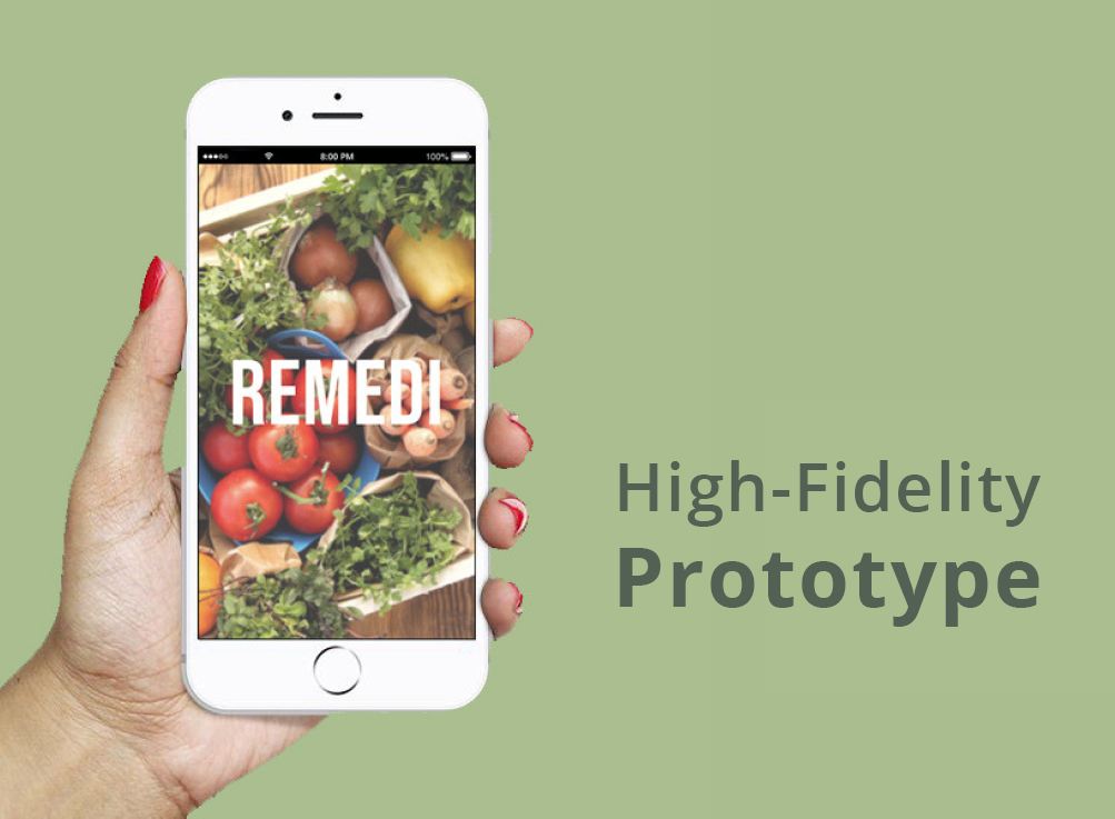
3. High-Fidelity InVision Prototype:
We translated our Sketch wireframes into a Hi-Fi prototype, produced in InVision.
View our prototype below, which displays the applied changes made based on information gathered in usability testing.

4. Hi-Fi Usability Testing & Report:
We first wrote a usability testing script that included comprehensible, distinct scenarios and tasks.
We then tested our high-fidelity prototype on 5 users, carefully observing how they interacted with the prototype.
We then assessed our findings by reviewing recordings and notes, and produced a usability testing report that included our discoveries, analysis, and recommendations for each issue.
5. Accessibility Report/Style Adjustments:
As UX UI designers, it was incumbent on us to make sure our digital product was accessible.
We tested our app and determined that changes to contrast and type size were necessary in order that those affected by color blindness could view the interface and that the typography would be legible for most people.


6. iOS HIG Compliance:
We designed our app in keeping with iOS Human Interface Guidelines (HIG) to ensure that our product integrated flawlessly with Apple platforms.
We made adjustments to the interface based on the iOS HIG so the user could experience seamless interaction with our mobile app.
Our goal was to create a consistent, easeful experience for the user.
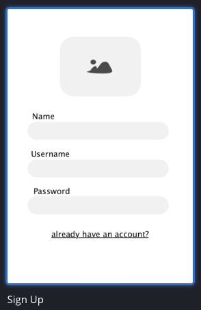
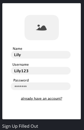
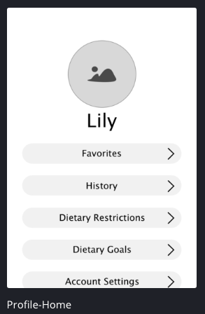
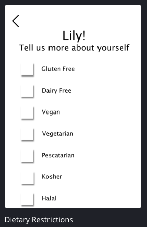
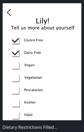
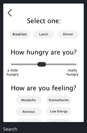
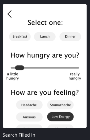
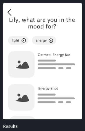
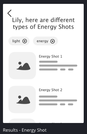
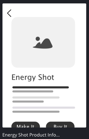
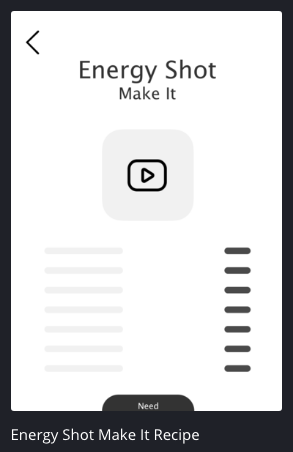
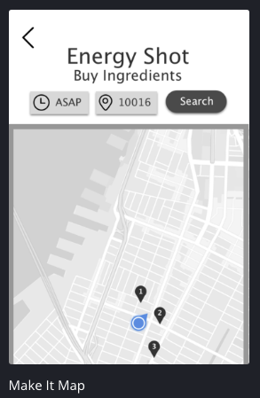
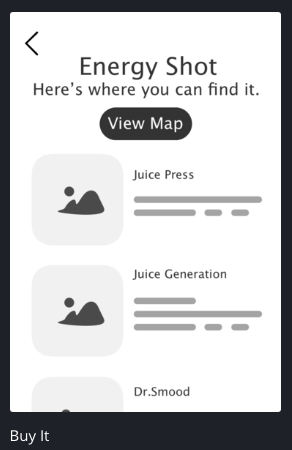
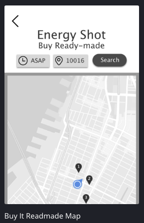
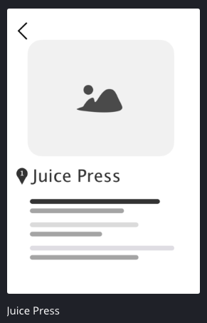
InVision High-Fidelity Prototype:
Our Hi-Fi prototype was functional and contained a logical, inherent navigable path initiating from an entry point to an exit point that reflected the user’s goal.
Some feedback we received from our users:
4.5/5 Average user rating on how intuitive the app is, on a scale of 1-5 (5 being the most intuitive)
5/5 Users said that they would use Remedi and that this was a solution they were very interested in*
*This was unprompted, users said this after they were asked for general feedback.
User Quotes:
”This would be really helpful for me.” ~ User 3
”I like how it is targeted for dietary restrictions and how comprehensive it is.” ~ User 5
7. Partnership
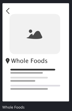
We researched companies that would be ideal to partner with and selected Whole Foods because their mission aligns harmoniously with Remedi’s values and goals.

8. Specifications Document:
A specifications document was prepared, which included design and functional details of the user interface including all possible actions the end user might perform.
The specifications document was necessary for the developer to build out the product. It communicated our product’s intended capabilities, appearance, and the user’s interactions with it.
Examples of what was included in the “Spec Doc”:
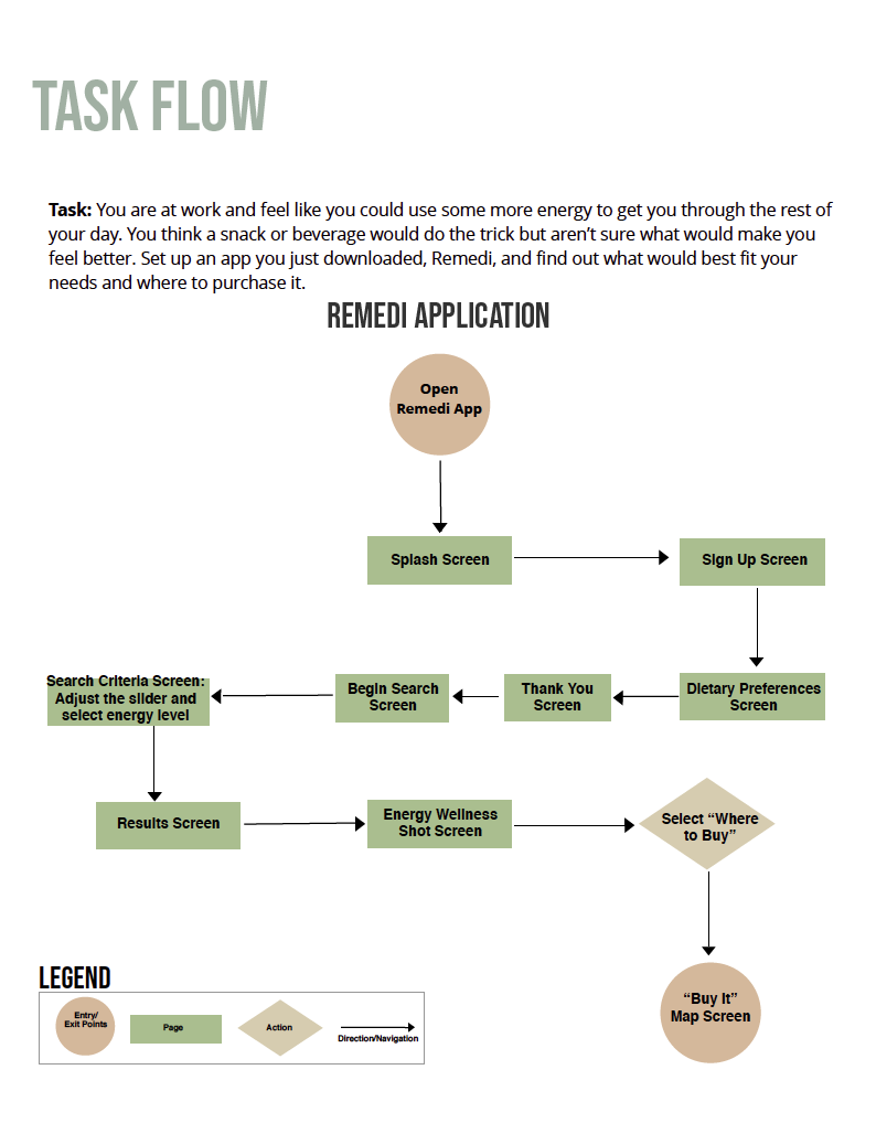
Task Flow:
A task flow is created to understand every step it takes to complete a task. It demonstrates the motivation and steps a user takes in a system to accomplish a specific goal.
User Flow:
A user flow helps us understand what a user might need at a certain step. It demonstrates the motivation and steps a user takes in a system to accomplish a goal while accounting for different paths a user might take.

Colors and Typography:
These were the colors and typefaces incorporated in our app. The colors passed accessibility testing and the font sizes were appropriate to iOS HIG standards.

NEXT STEPS:
Add a filter to accommodate allergies.
Add a feature for delivery service.
Include a feature for virtual nutrition coaching.