
The Team:
Irene I.
Sabrina B.
Surbhi G.
Danielle N.My Role:
UX Researcher
UX Designer
UI DesignerProject Overview:
This project was immensely instructive because my team and I had the opportunity of working directly with the CEO and COO of an existing business, Boxcar. We were in constant communication with them throughout the duration of the project. Additionally, we communicated with their CTO and the Director of Customer Service. This reciprocity of information and feedback was beneficial to the entire process. Their goal was to aggressively expand their parking footprint over the next 2 years in the suburbs of New Jersey and Connecticut. Our objective was to help them achieve this.

About the Company:
Boxcar is focused on improving the suburban commuting experience. Their app based platform offers innovative solutions (parking), superior products (transportation), and attentive customer service. Their userbase is comprised of suburban commuters located in New Jersey and Connecticut.
● Parking: Airbnb rental model focused around transportation hubs
● Transportation: luxury commuter buses from underserved areas
The Challenge:
Our main task was to assist Boxcar in improving their customer convertibility ratio. They were losing a significant percentage of users between the download and account creation stages. Our job was to help discover the following:
1. Who is Boxcar losing?
2. Why is Boxcar losing them?
3. How can we enhance the Boxcar user experience to increase user retention rate?
Empathy, and then research, form the foundation for User Experience Design.
Deliverables:
Usability Testing on Existing Boxcar App and Report
User Interviews and Report
1. Usability Testing and Report | Existing App:
In order to understand how users engaged with and responded to the existing Boxcar app, my team and I carried out usability testing. Through these tests we were able to observe users’ behaviors with the app, discover their expectations of it, understand their motivations, and learn what was not working and why problems were occurring.

Objective: To understand the usability of the app and find the pain points or design opportunities on the existing app.
5 Users:
● 28-55 yr | 3 Females | 2 Males
● Currently travel to the city
● Use several modes of transportation to commute
● Frequently use commuting apps
Information we gained from the Usability Test:
Opportunities for Growth:
● Icons, while attractive, were not intuitive
● Upon downloading the app, users were unable to determine what the services were that Boxcar was offering
● Navigation through the app was difficult due to confusion with the key features of the app (Bus, Park, and Workspace)
● Users were not aware that the 3 features were discrete and did not function interdependently
● Filtering options were confusing
● Visualizing the parking and bus route was difficult

2. User Interviews and Report
In order to increase our awareness of the problem space, we interviewed existing users to evaluate their use of the product. We also interviewed potential users to assess Boxcar’s targeted users’ requirements, behaviors, and motivations.

In this phase, we synthesized the research data we collected. Each user interview provided valuable insights.
Deliverables:
Insights
Affinity Map
Persona
Journey Map
Problem Statement
1.1 User Interviews | Existing User Insights
● Frequency and timing of bus service may not be conducive to user’s current schedule
● Financially it may be worth it if the bus picks up at a convenient location
● Do not complicate the app; users have learned how to use the app
● Love that my favorites and reservations are easily accessible
● Enjoy the advance booking option
● Customer service is amazing
“I used to take an Uber to the train, Boxcar has been a lifesaver!”
1.2 User Interviews | Potential User Insights

“I keep the app downloaded, but I have trouble using the parking feature.”
2. Affinity Map
We organized the key insights into categories. We arranged these recorded insights in an Affinity Map, which was a tangible, visual, editable design vehicle to fully comprehend the data we amassed. It was an effective tool for classifying information according to relationships and themes. The Affinity Map displayed trends and patterns, and revealed opportunities for discovery as well as improvement.

3. Persona
Through Affinity Mapping we were able to develop a persona, identifying this ideal customer’s pain points, needs, behaviors, and goals. Benjamin, our persona, represented Boxcar’s primary user who endures the daily struggle of seeking parking as part of their commuting experience.

4. Journey Map
After developing a persona we created a journey map, which is a visualization of the user’s existing process to accomplish a goal including interaction with a product or outside of that. It was based on Benjamin’s routine and requirements and was an effective tool because through it we understood the user’s pain points as opportunities for improvement. In creating this journey map, having empathy for Benjamin and his commute was the first step.

DISCERN :|: The Problem Statement
Based on our research, the synthesizing of the data, and the in-depth understanding of the user through persona and journey map development, we could now redefine the opportunity and articulate the design direction. To provide clarity and focus, we crafted a problem statement, which identified the problem, not the solution.
Problem Statement:
Every day users commute to New York City from New Jersey and Connecticut via public transportation.
Benjamin, a financial planner, is a punctual man, but his commute is unpredictable. He is never confident that he will have a place to park or a seat on the morning train. He starts his day very stressed and upset.
How might we help him have an enjoyable and productive commute?
In this phase, we increased our ability to visualize the problem. We generated many ideas, quickly sketching them, which led to more innovative options and decreased the likelihood of early attachment to any design solutions. It was a collaborative effort, and this amalgam of different perspectives improved the quality of the design process and the resulting product.
Deliverables:
Competitive Analysis
Design Studio Documentation
MoSCoW Map
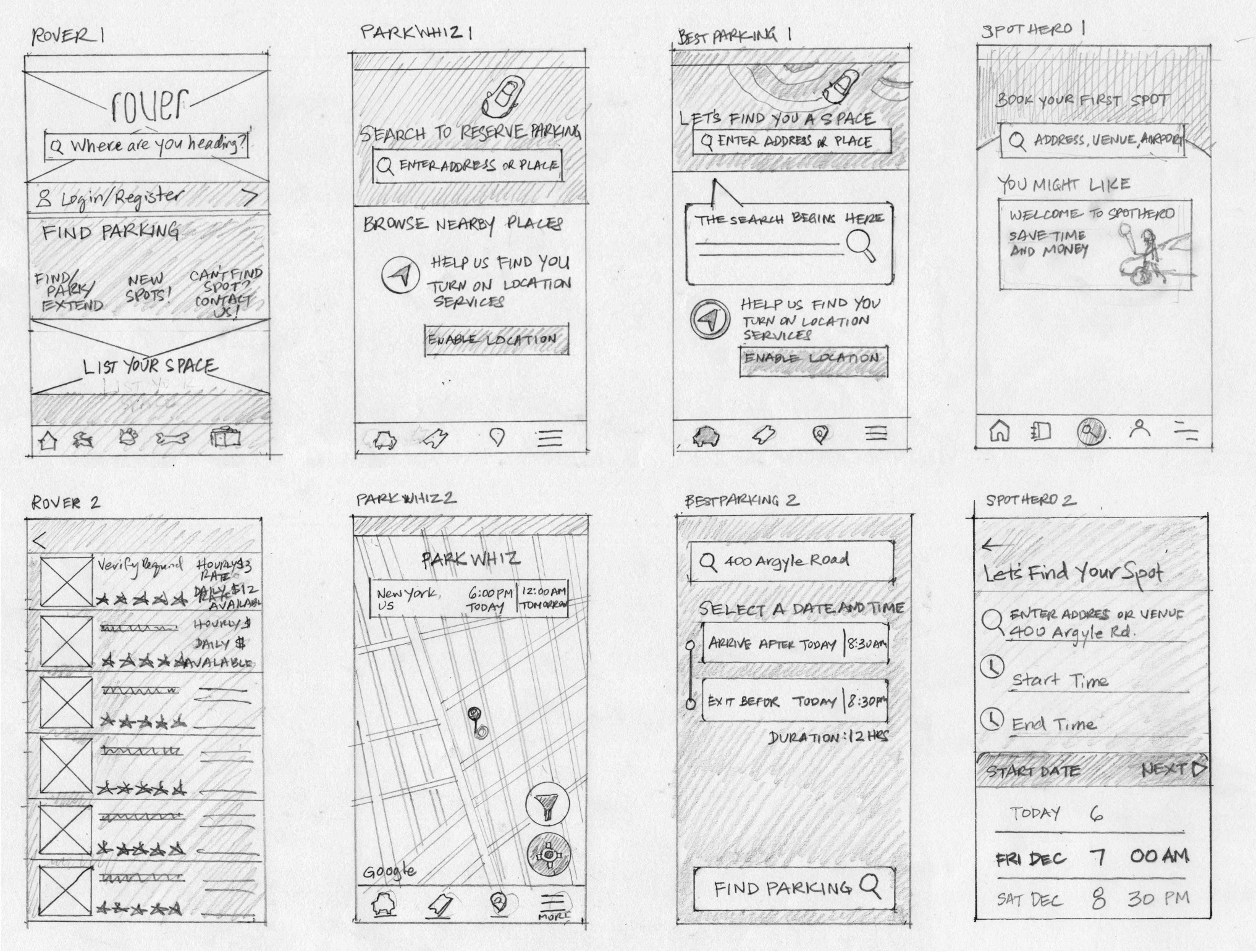
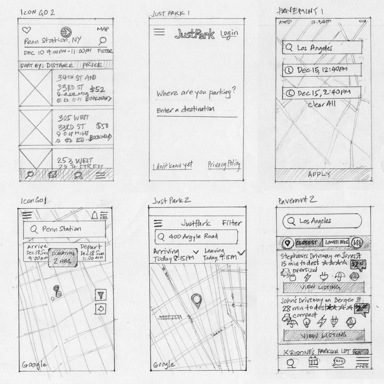
1. Competitive Analysis
Before embarking on the design phase, we did a competitive analysis to understand the landscape in which Boxcar was situated. This was valuable because it informed us about who their competitors were, what conventions were used in the industry, what features would be innovative or duplicative, and how we could differentiate.
Direct Competitors
After we provided our client with the existing app’s Usability Testing Report, our stakeholders requested that we concentrate solely on the parking aspect of the app. We therefore honed our competitor research in the realm of parking.

Indirect Competitors
Researching who the indirect competitors were raised our awareness about what functionality was being offered, and design options that worked and that didn’t work.
2. Design Studio
We conducted 6 rounds of Design Studio in which all team members sketched out our ideas within established time (rapid) and subject parameters. After the sketching portion, we each had the chance to evaluate all team members’ concepts. We would build out the ideas that were agreed upon by consensus. The Design Studio was crucial in defining what we would develop.

3. MoSCoW Map:
This tool was invaluable in prioritizing what features we would include. Because our time on this project was very limited, we needed to identify what was necessary and technically feasible.

The Design Studio and MoSCoW Map were fundamental in the collective decision to focus on:
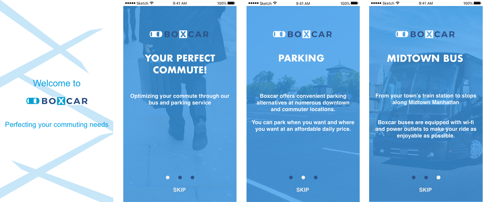
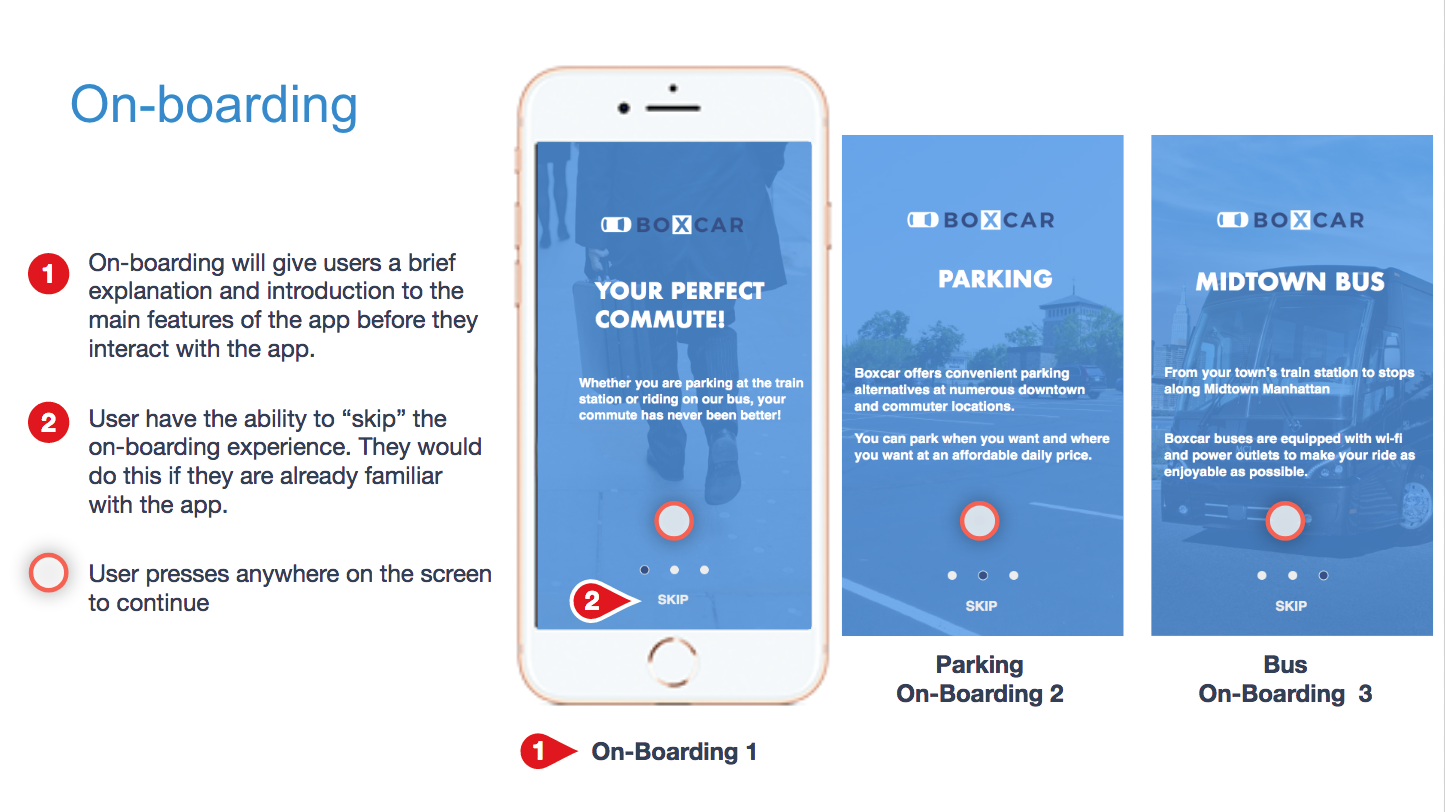
Creating an Onboarding Experience
This was vital in introducing first-time users to Boxcar’s features, and to engage their curiosity to continue.
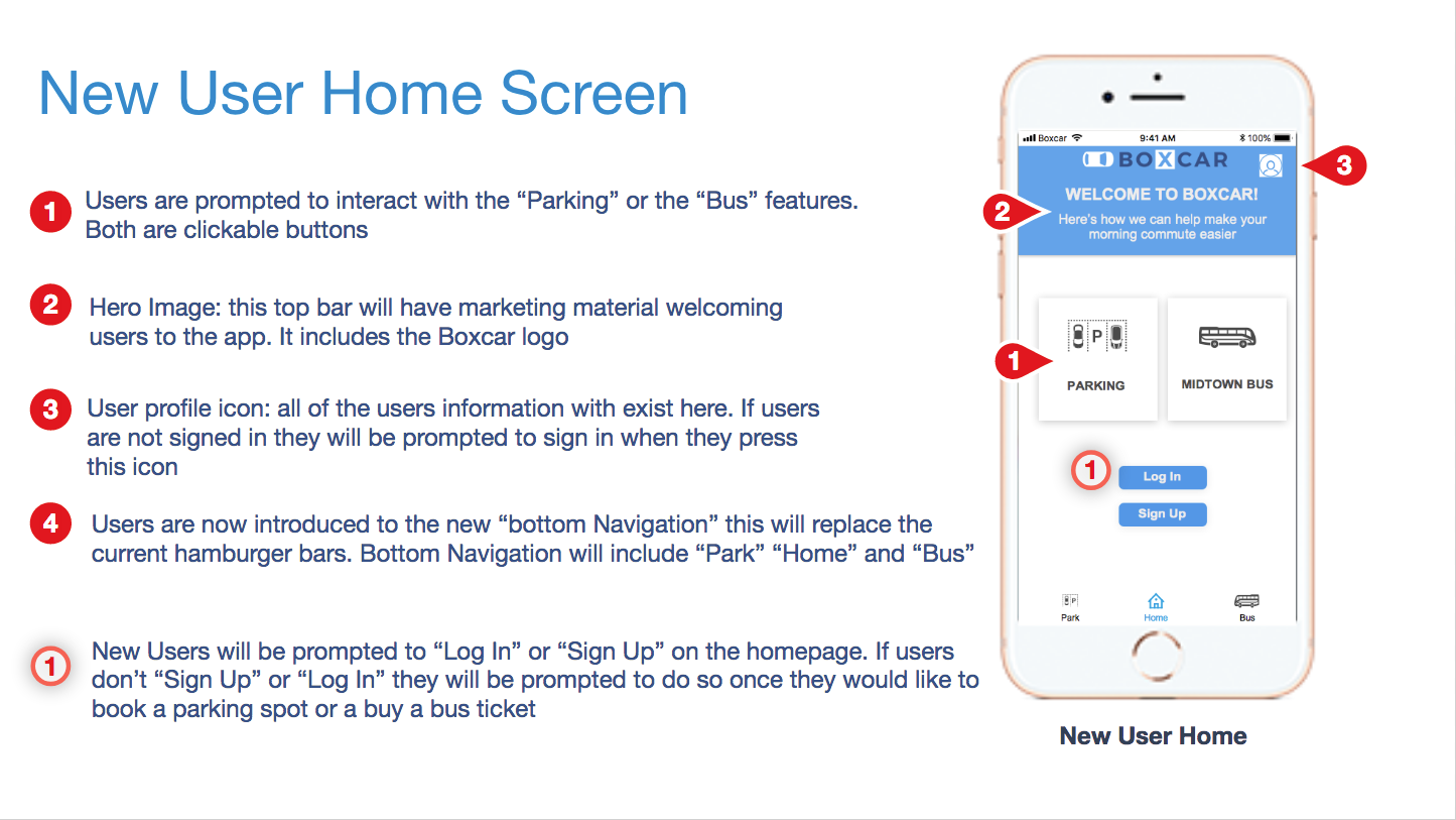
Developing the Homepage
Home screens differ according to users’ needs. It was logical to design distinct home screens—for the existing user, and the new user.
Improving the Parking feature
Parking was the core of Boxcar’s business. We needed to create a streamlined, easeful user experience that provided practical functionality such as conveniently locating parking near the train station at specific times.
In this part of the process, we produced and put into action what we ideated in the previous stage. In this phase, prototyping, testing, analyzing, and iteration took place.
Deliverables:
Low-Fidelity Wireframes (Sketches)
Mid-Fidelity Wireframes
High-Fidelity Wireframes
High-Fidelity Clickable Prototype in InVision
Usability Testing Reports for All Iterations
Specifications Document
A Quick Snapshot:
The design process is iterative. It evolves from:
Low-Fidelity sketches, which are tested with Usability Testing and improved upon, then…
Mid-Fidelity wireframes are produced and tested with Usability Testing, modified for enhanced utilization, then the...
High-Fidelity prototype is developed, which is a refined version incorporating more sophisticated visual design. This iteration also goes through Usability Testing.
1. Low-Fidelity Sketches:

Lo-Fi Sketches for Onboarding
Lo-Fi Usability Testing | Some Key Insights:
5/6 Users liked the onboarding
6/6 Users understood what the app’s main functionalities were from the onboarding
4/4 Users knew to click on map prices to view specific details on listing
Some things to change:
Onboarding experience should not have a message that is clickable; it should be the message by itself
Swipe action was unclear
Icons need updating
Should have clear call to action for Park, Bus, or Workspace
Try to make parking symbol more clear
Expect to see My Favorites and Reservations if logged in as a user
Should be able to skip tutorial from onboarding
2. Mid-Fidelity Wireframes:
These were created using the Sketch app


3. High-Fidelity Wireframes:
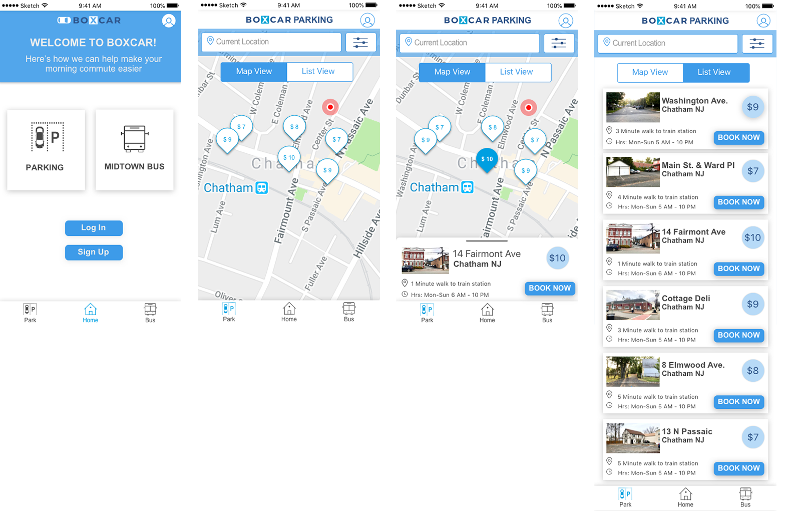
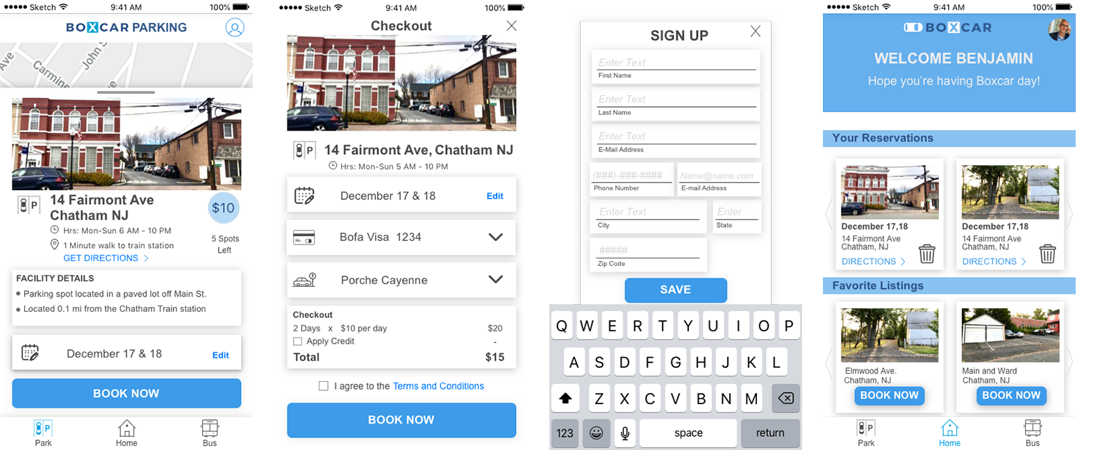
4. Usability Test Results:


5. Specifications Document:
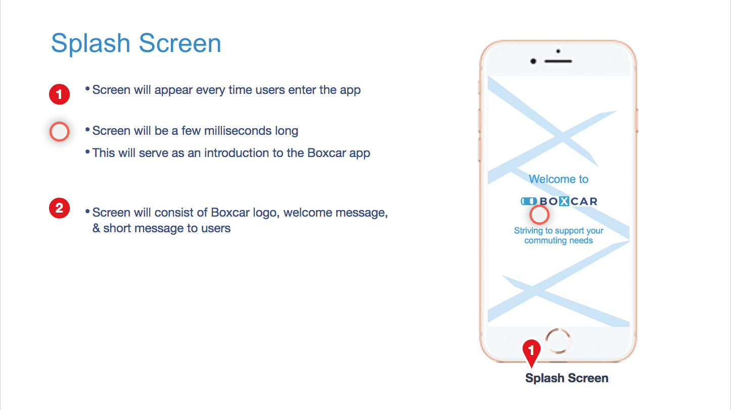
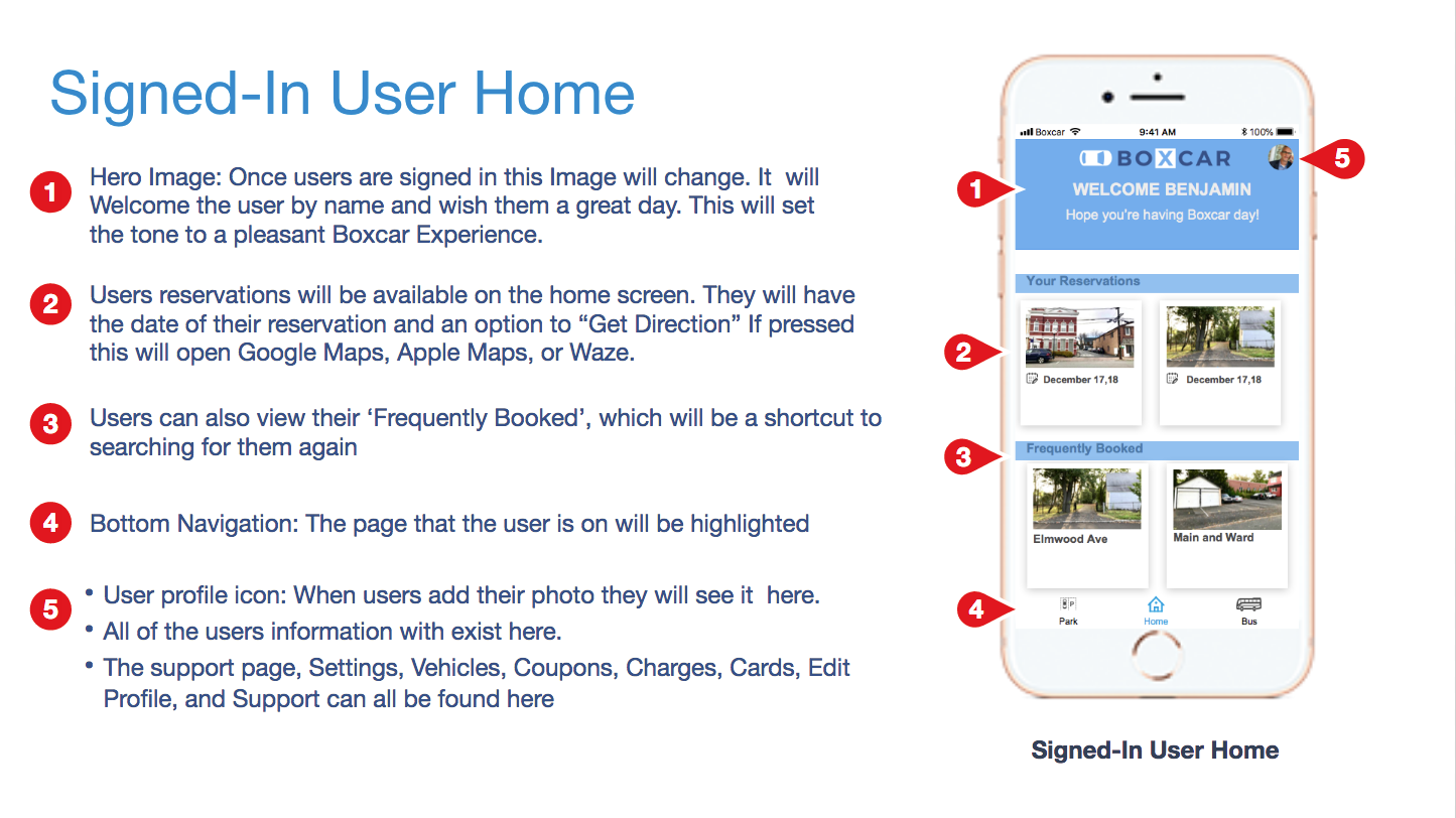
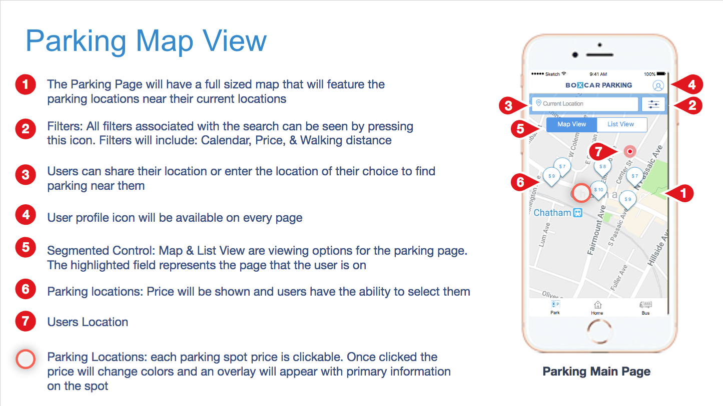
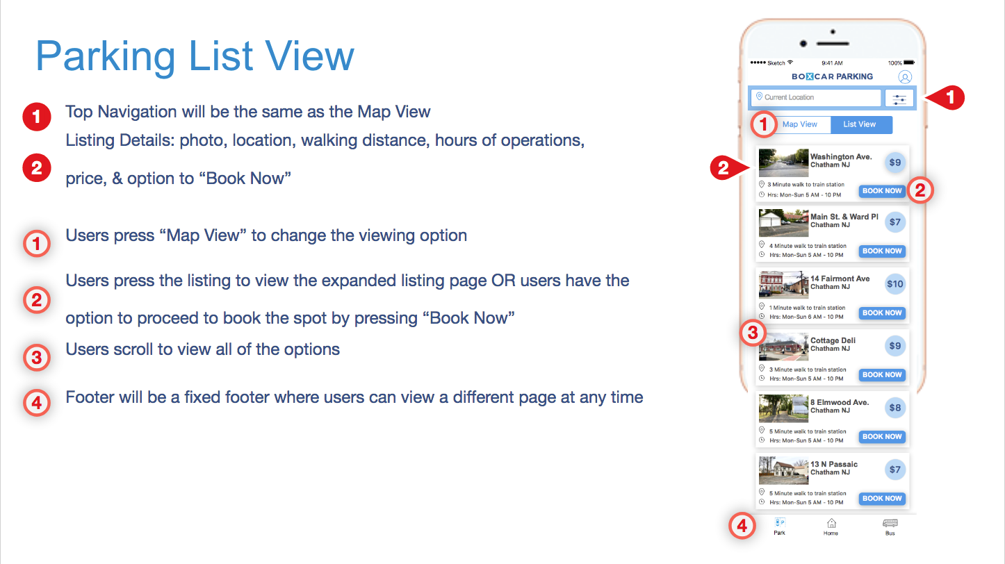
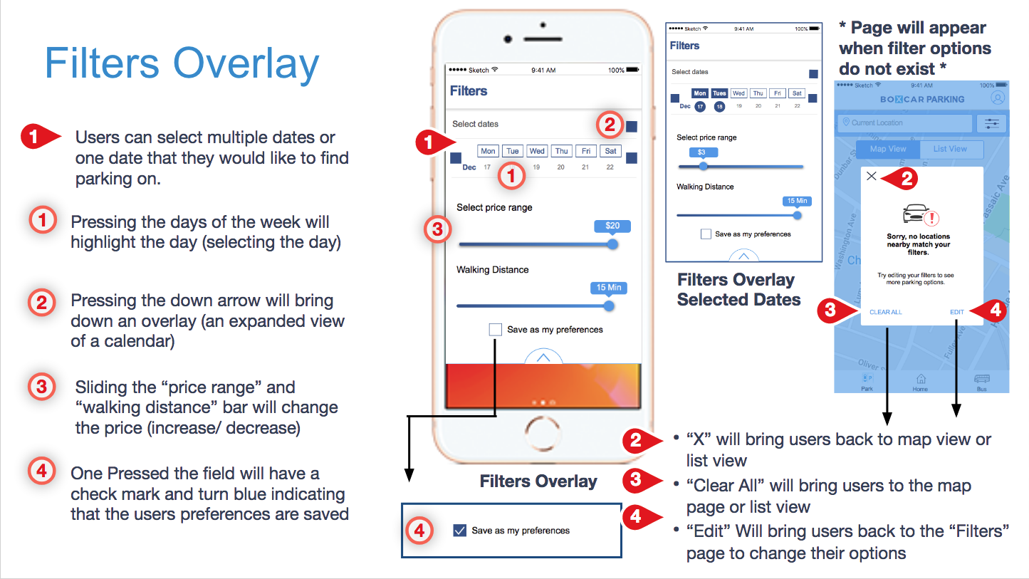
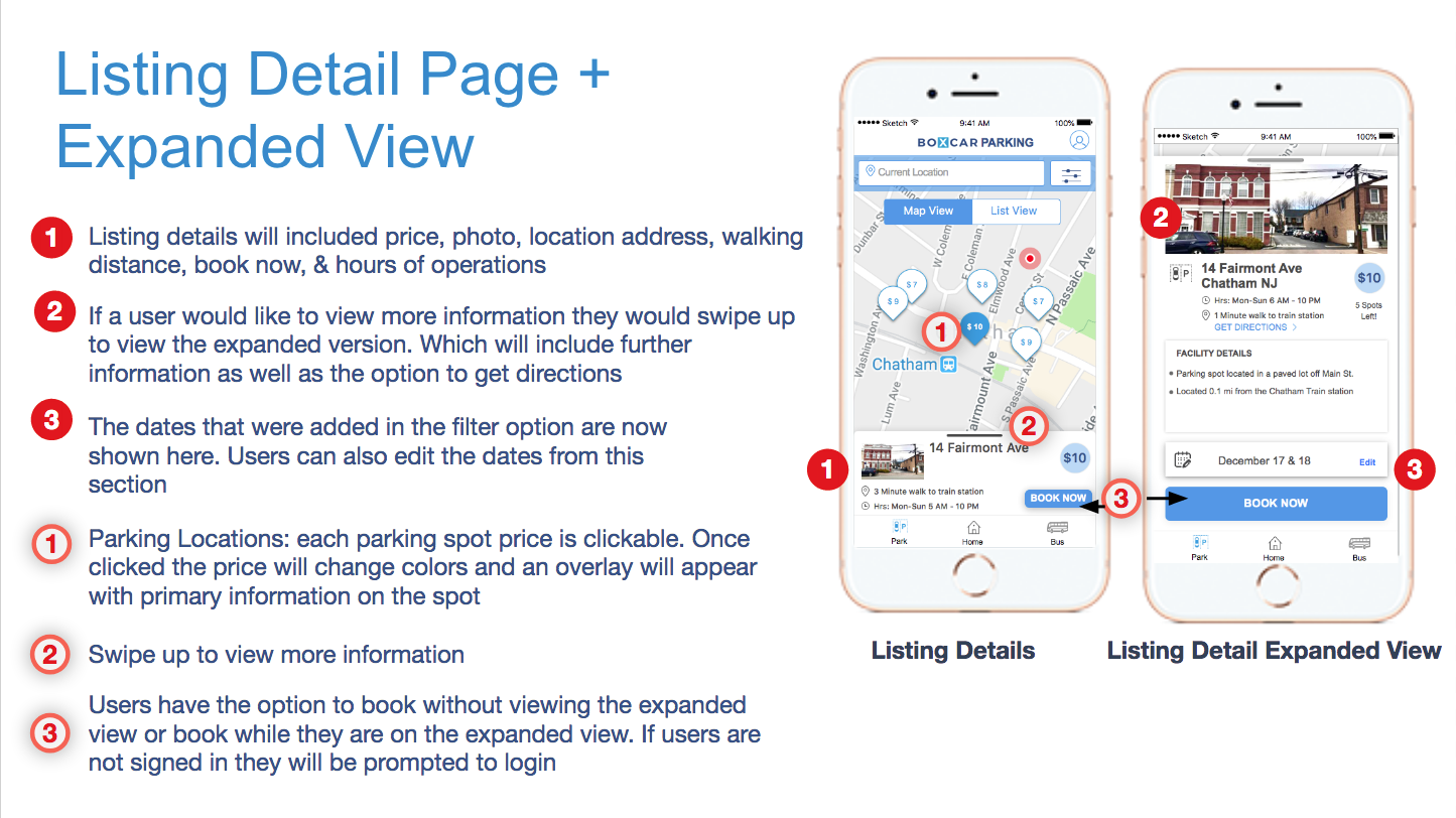
A specifications document was produced that contained design and functional details, such as annotations to guide the web developer. These are examples of the annotations, which demonstrate the functionality of the app.

6. InVision High-Fidelity Prototype

Next Steps
Continue researching and building out bus portion to maintain consistency
Interview users on how a website might benefit their commute
Enhance User Interface design, possibly adding another color to the app
Building and integrating owner dashboard
Marketing: targeting users from towns that do not have train stations
Partnership with municipal parking lots
Conclusion
The client’s response to our project outcomes was extremely positive. We provided the necessary files for their developer to utilize and they did integrate some of our key ideas into Boxcar’s design and function.