The Team:
Irene I.
Margaret M.
Alex S.My Role:
UX Researcher
UX Designer
UI DesignerThe Challenge:
Our assignment was to create a responsive website that solves the problems of real users in the category of “Education”. We approached this vast subject by first producing a topic map and then narrowed our focus to the problem space of “Volunteerism and Education”.
The following documentation describes the process and the corresponding deliverables involved with this project.
Our job was to understand the behaviors of users within this category and identify areas of opportunity for improvement.
Deliverables:
Screener Survey
User Interviews
1. Screener Survey and Results:
Screener targeted the right audience across a balance of appropriate demographics.
We recruited people who represented our actual audience.
The respondents met predetermined criteria to qualify for further research.
We framed our questions in a way that helped garner the right users.
2. User Interview Documentation:
Seven interviews were conducted of people that were appropriate to the problem space.
Used open-ended questions that led to insights in the problem space.
Interview script/Discussion Guide was written.
Sample Questions:
You answered our survey and stated that you had previous volunteering experience. Can
you tell me a little bit about how you found that volunteering opportunity?
What organization did you volunteer with?
Why did you volunteer?
What did you learn from this volunteer experience?
If you shared any of your skills or strengths throughout this process, could you tell
me a little about what others might have learned?
In this phase, we synthesized the acquired research data.
Deliverables:
Insights
Affinity Map with “I” Statements
Persona
Journey Map
1-2. Insights | Affinity Map & “I” Statements:
We collected insights from the interviews using affinity mapping. Insights reveal the “why” and motivation behind a behavior.
Themes that emerged from our interviews were culled.
We conducted and documented affinity mapping process and formed “I” statements.
We focused on who the user was, what they did, and why they did it.
Our affinity map in progress
Insights:
“I educate others by....”
“I have many skills to share”
“I give back to my community”
“I look for volunteer information in different places”
“I learned a lot while volunteering”
“I have many passions”
Users would like to share their skills but find it difficult to find available volunteer opportunities.
Users found no dedicated resource or portal for volunteer opportunities which then requires them to conduct comprehensive research.
Nonprofits websites can be hard to navigate as their funds are minimal and they don’t always have updated information.
Users found it hard to connect with the right contact when contacting an organization.
Users found that the volunteer opportunity was frequently unavailable by the time they found it.
Users tend to use Google, Facebook and friends to find volunteer opportunities.
7/7 Users have volunteered for an educational organization in the past.
6/7 Users have never used an application or website or platform other than Google or Facebook to help them find volunteer opportunities.
7/7 Users are interested in volunteering at the time of the survey.
3. Persona:
We identified and created a primary persona utilizing insights from our interviews.
4. Journey Map:
We included relevant touchpoints that highlighted the user’s existing behavior within the problem space of volunteerism and education.
We applied our research to inform our documentation of the user’s behavior.
“How Might We…?”:
We crafted a problem statement that was focused in scope and backed by the user research conducted:
“Allie is very interested in doing volunteer work teaching healthy food preparation using local, seasonal, and sustainable ingredients. However, she does not know where to find the opportunities, or how to connect with the key people. How might we help Allie connect with the appropriate volunteer opportunity to share her skills with those who would benefit from them the most?”
In the third phase of our process, we used feature prioritization as a tool to develop our designs while working within parameters.
Deliverables:
Design Studio Documentation
MoSCoW Map
1. Design Studio Documentation:
Considering the needs of our persona, we conducted two rounds of Design Studio to generate ideas, potential solutions, and features. Each team member drafted hand-drawn sketches on paper illustrating features with a visual sequence, and explained his/her idea. Each team member had the opportunity to comment on every idea/sketch.
With our problem statement, user goals, and feature presentation mapped out, we hand-sketched our lo-fi wireframes. Sketches were quick and rough, yet adequate to provide a sense of each screen design.
Example of one round of a Design Studio:
Create:
5 minutes - Everyone sketching in silence, as many ideas as possible.Deliberate:
2 minutes - One member of team pitches all his/her ideas while rest of team is silent.
3 minutes - All other members take turns giving quick feedback on the ideas just “pitched”. Presenting member is silent. Repeat for each member.Document:
Document every idea generated in the round.Reset & Repeat
2. MoSCoW Method Map:
(Features that Must, Should, Could, Won’t be included)
Using the documentation of potential ideas generated in our rounds of design studio, we created a list of potential features of the responsive website to help our user.
We drew four quadrants on an X and Y axis with Must, Should, Could, Would as designators for each quadrant. We then assigned the potential feature to the appropriate category.
We digitized this and used the map as a basis for future design decisions.
With this diagram of potential features and their relative priority/importance before us, we were able to consider how they would integrate into the app.Visual: Show MoSCoW Map
In the implementation phase, we materialized what we ideated in the previous stage. We prototyped, tested, analyzed, iterated, and analyzed further.
Deliverables:
Low-Fidelity Wireframes, Hand-drawn
Mid-Fidelity Wireframes in Sketch
Clickable Mobile Prototype in InVision
Usability Testing report
1. Low-Fidelity Wireframes:
2. Mid-Fidelity Wireframes with Annotations:
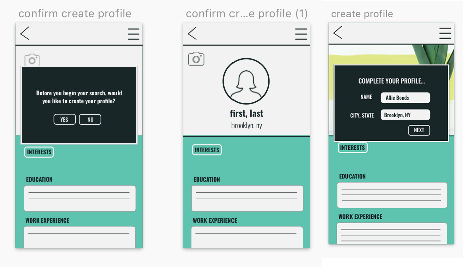
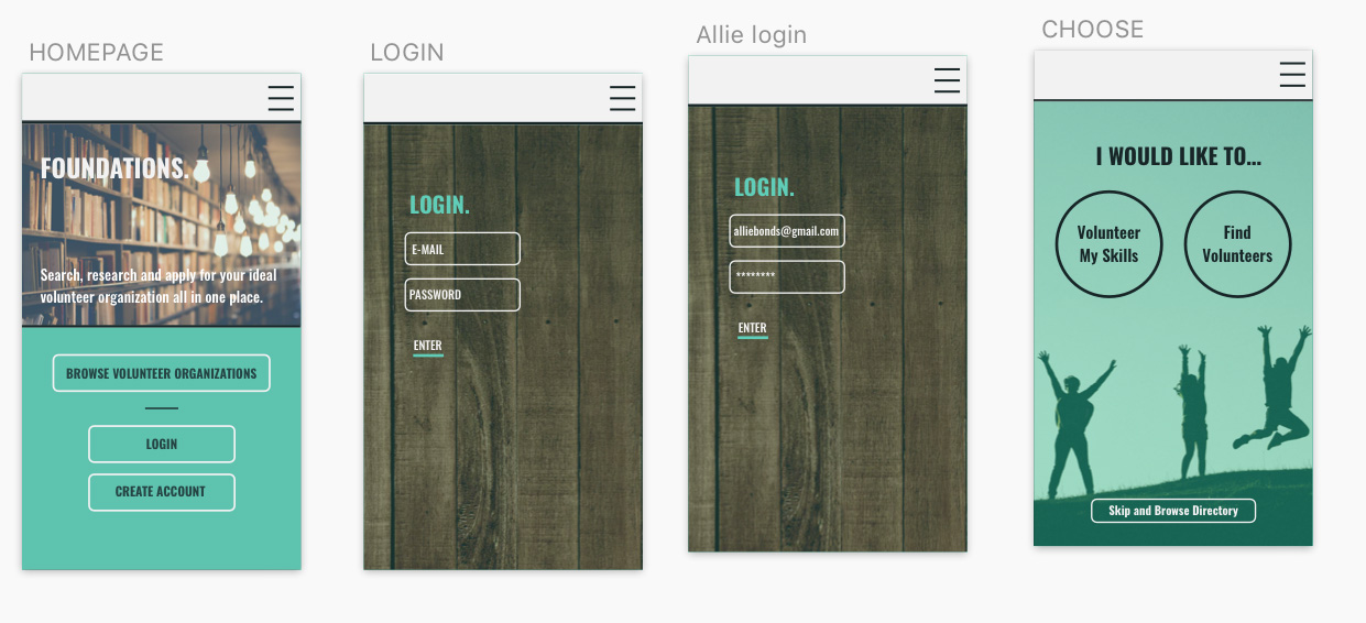
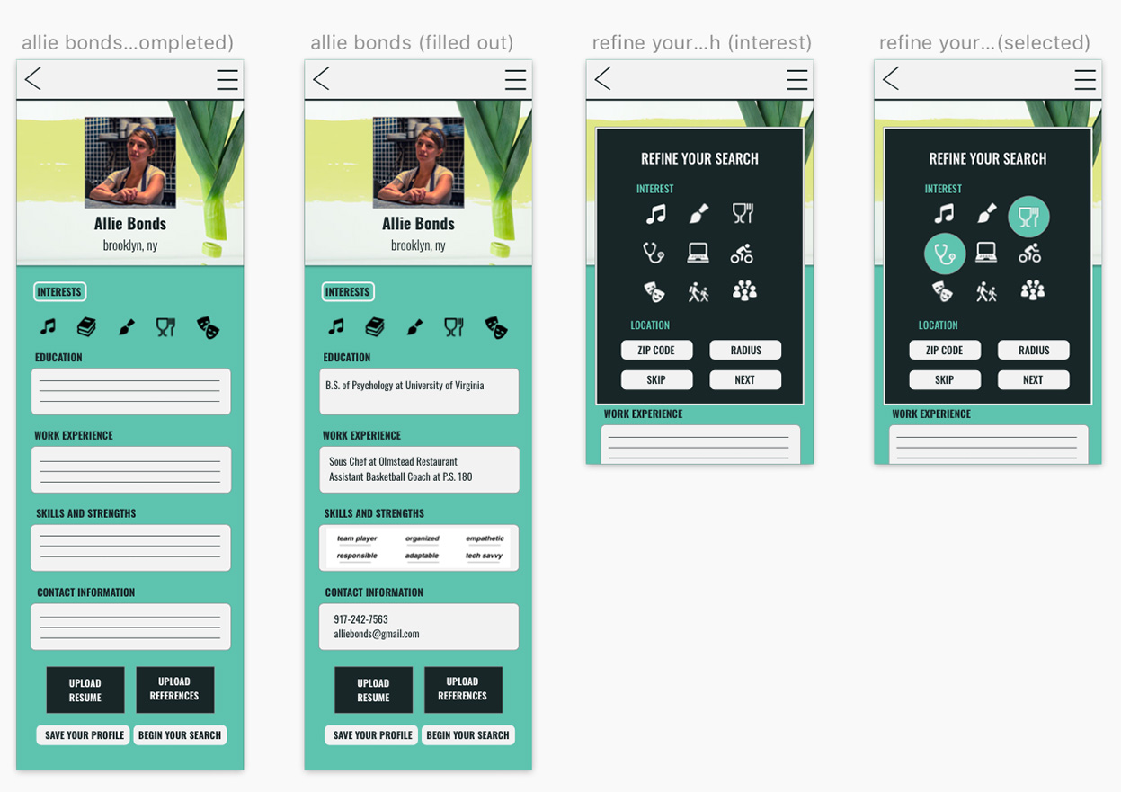
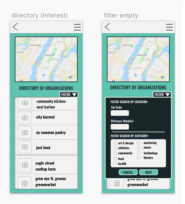
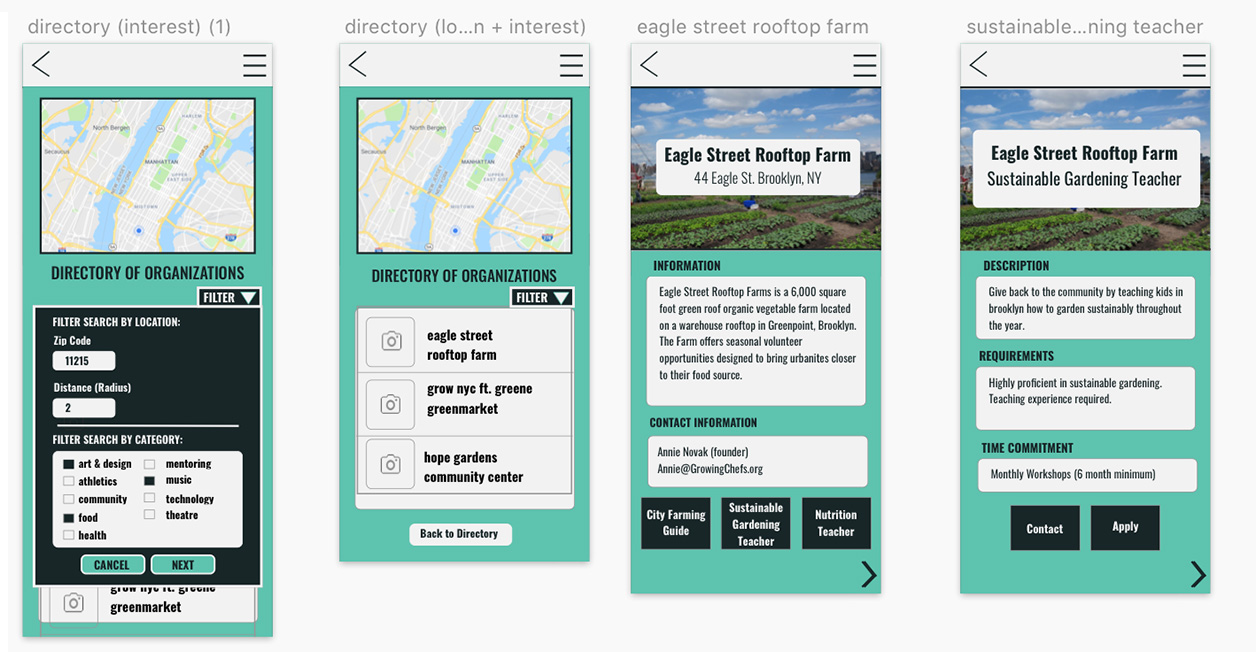
Using the design concepts generated in our design studio and the features we prioritized using the MoSCoW method, we embarked on creating mid-fidelity wireframes in Sketch for our mobile platform. Before starting this, we made sure our designs represented a path through which the user could solve their problem and achieve their goal.
These mid-fi wireframes contained all the functional elements of our design without the development of the “visual design”.
2. Clickable Mobile Prototype in InVision:
Using our mid-fi Sketch wireframes, we created a clickable, functional mobile prototype in InVision that included a navigable path from an entry point to an exit point that reflected the user’s goal.
By building a website, which functions as a directory of volunteer opportunities, Allie will have the ability to connect with volunteer organizations and positions to share her skills.
With Foundations, Allie will be able to learn about and apply for opportunities based on her interests and location. This will help Allie feel less overwhelmed about the research phase of volunteering.
3. Usability Testing & Report:
In this step, we tested our mid-fi prototype employing a usability testing script including clear scenarios and tasks that we prepared.
One round of usability testing on the InVision prototype with 7 participants was conducted.
A usability testing report that included findings, analysis, wireframes and recommendations for each issue was generated.
Example:
Scenario + Task 1 | Scenario: You are Allie, a busy working professional who would like to search for a new volunteer opportunity related to food education, closer to your home in Brooklyn. Task: Login to the mobile site, and fill out your profile (name, city/state, interests & skills), and your general application form.
In this final phase, we used the feedback from our usability tests and iterated on our previous mobile designs while elevating them to a higher level of fidelity. A higher level fidelity incorporates visual elements such as color, typography, etc. to address the user’s emotional experience with our website. We created a higher-fidelity desktop prototype, tested it, and then produced a usability testing report that included results and insights.
Deliverables:
Mobile Wireframes with Annotations
Desktop Wireframes with Annotations
Clickable InVision Prototype
Usability Testing & Report for Desktop Prototype
1. Mobile Wireframes with Annotations:
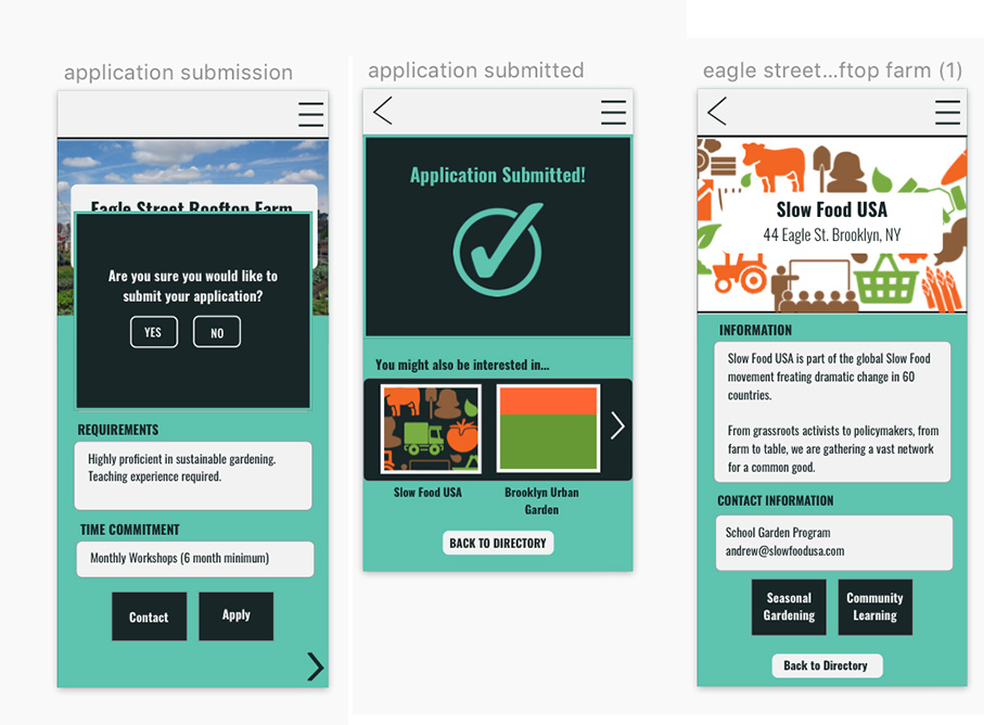
This final iteration reflected a higher level of fidelity.
Wireframes included a proper amount of detail and were consistent in quality and element placement.
Annotations were standardized in formatting, with labels comprehensible to any audience.
Wireframes represented the general design concept and a path from entry point to a potential solution.
Hi-Fi Mobile Wireframes’ Annotations
2. Desktop Wireframes with Annotations:
Wireframes reflected the fidelity of the final iteration of the mobile wireframes.
Wireframes included a proper amount of detail and were consistent in quality and element placement.
Annotations were standardized in formatting, with labels comprehensible to any audience.
Wireframes represented the general design concept and a path from entry point to a potential solution.
Hi-Fi Sketch Desktop Wireframes
Hi-Fi Desktop Wireframes’ Annotations
3. InVision HIGH-FIDELITY Prototype:
Our prototype was functional and included a navigable path from an entry point to an exit point that reflected the user's goal.
4. Usability Testing & Report for Desktop Prototype:
Usability testing script included clear scenarios and tasks.
One round of usability testing was conducted on your InVision desktop prototype, 4 participants per round, to understand the efficacy of our prototype.
Usability testing report included findings, analysis, wireframes, and recommendations for each issue.
Report included usability testing script.
Example:
Scenario + Task 3 | Scenario: After reviewing all the relevant information, you realize your schedule and location fit the demands of the Sustainable Gardening Teacher position. Task: Apply for the Sustainable Gardening Teacher position and receive a confirmation of submission.
“This website seems like it would solve many of my roadblocks when looking for an opportunity” ~ User 2
Next Steps:
Additional usability testing.
Delete New User/Existing User options on relevant screens.
Add a feature to share opportunities and information such as a job profile via social media, email or text message.
Clarify the purpose of the ‘badges’ by labeling them with “My Interests are…”.
Consider adding a feature where volunteers can share opportunities with their friends.


